
In the world of casinos, color is far more than mere decoration. It serves as a subtle guide, a psychological cue that shapes the player’s experience without them even realizing it. From the moment one steps onto the casino floor, the palette of colors is carefully orchestrated to influence mood, perception, and behavior. Designers leverage an understanding of human psychology, combining it with strategic spatial planning to create environments that feel both stimulating and familiar. By employing consistent color schemes across games, tables, signage, and décor, casinos cultivate a sense of continuity, which builds comfort and encourages extended engagement.
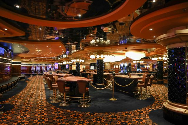
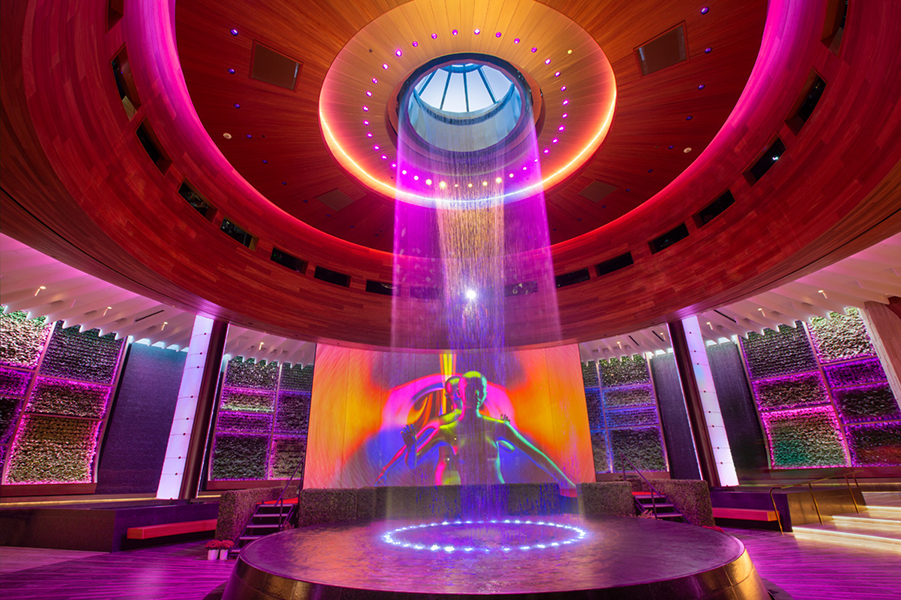
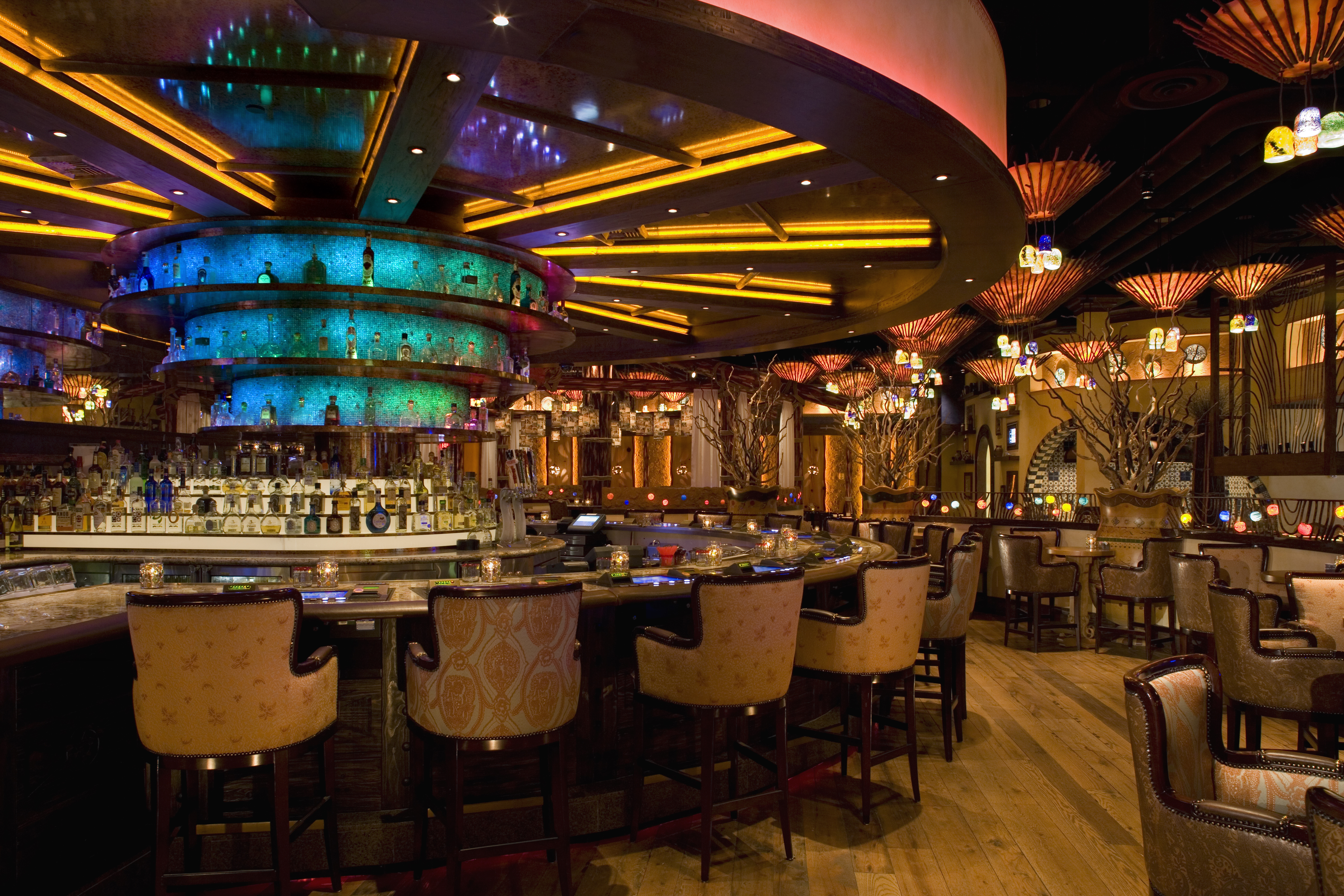
The primary goal of a casino’s color system is to create a recognizable and welcoming environment. Bright, vibrant colors like red, gold, and purple are commonly used in gaming areas because they evoke excitement, energy, and luxury. Red, for instance, is known to increase heart rate and can enhance feelings of thrill, which is particularly effective around slot machines and high-stakes tables. Gold accents communicate opulence and reward, reinforcing the sense of possibility and the potential for winning. Purple, often associated with creativity and sophistication, subtly elevates the perceived value of the space. These color choices are never random; they are carefully selected to align with the emotions casinos wish to evoke, and they are repeated consistently throughout the property to build visual familiarity.
Consistency in color usage is crucial for cultivating a sense of comfort. When a player encounters similar color cues across different areas of the casino, the brain processes these signals as familiar, reducing cognitive load and anxiety. This familiarity fosters an intuitive understanding of the environment, allowing players to navigate spaces without excessive thought. For example, VIP sections often feature a distinct palette—perhaps darker, richer hues—to communicate exclusivity. Similarly, areas designed for casual play might employ lighter tones, making the space feel more accessible. By maintaining consistent color schemes for specific functions, casinos allow patrons to recognize the purpose and status of each area quickly, reinforcing a subconscious sense of predictability.
Color systems are also used to guide attention and behavior. Casinos strategically place contrasting colors to highlight important areas, such as entrances, cashiers, or promotional displays. Bright or saturated colors attract the eye, ensuring that players notice key features or new games. Conversely, muted or harmonious tones may be used in peripheral areas to minimize distractions and keep attention focused on gaming experiences. This deliberate manipulation of color hierarchy not only supports practical navigation but also reinforces a structured and reliable environment, which can enhance a player’s sense of familiarity and trust.
Beyond individual colors, color combinations are essential for building identity and recognition. Casinos often develop a signature palette that extends across branding, signage, uniforms, and promotional materials. When these color combinations are repeated consistently, players begin to associate them with specific emotions or experiences unique to that property. This form of environmental branding strengthens memory and familiarity, encouraging repeat visits and loyalty. When a guest enters a casino and sees familiar colors, even in peripheral elements like carpeting, wall accents, or digital interfaces, it triggers recognition and reassurance, creating a subconscious connection that encourages comfort and engagement.
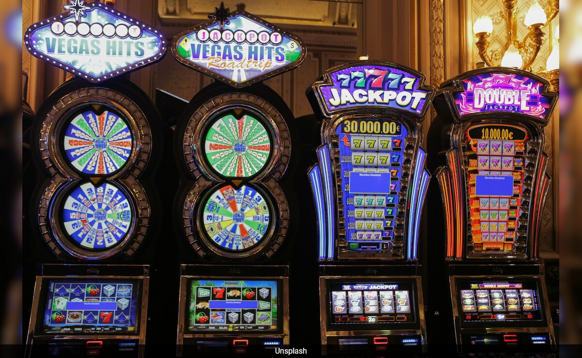
The psychological effect of color familiarity extends to game design itself. Slot machines, card tables, and roulette wheels often use recurring color motifs to signal categories, status, or outcomes. For instance, the use of red and black on roulette wheels is a globally recognized standard, helping players intuitively understand betting options and results. Similarly, slot machines may use consistent background hues and highlight colors for bonus rounds or winning lines, reducing cognitive effort and allowing players to focus on the excitement of gameplay. This repetition not only creates functional clarity but also contributes to the overall sense of a cohesive and familiar environment.
Lighting and materials work hand in hand with color to reinforce familiarity. The same red used on walls may appear warmer under gold-toned lighting, subtly enhancing the perception of luxury and excitement. Textures, such as plush carpets or velvet seating, complement color schemes to create tactile familiarity, encouraging prolonged engagement. Even digital interfaces, from touchscreen betting kiosks to mobile apps, mirror the casino’s palette, creating a seamless transition between physical and virtual experiences. By maintaining these visual and sensory consistencies, casinos ensure that each touchpoint reinforces the brand’s familiar identity.
The effectiveness of casino color systems relies heavily on cultural and psychological principles. While certain colors universally evoke particular emotions—like red for excitement or blue for calmness—regional preferences and cultural associations must also be considered. Casinos often tailor palettes to local expectations to maximize comfort and recognition. Additionally, the placement of accent colors, contrast levels, and repetition patterns are carefully tested for optimal psychological impact. By combining empirical research with intuitive design, casinos create environments that feel both dynamic and reassuring, making players more likely to remain engaged and return for future visits.
Ultimately, the strategic use of color in casinos is a sophisticated form of environmental storytelling. It communicates identity, guides behavior, and fosters familiarity without requiring conscious effort from patrons. The repetition of color cues across spaces, games, and media creates an invisible thread of consistency that reassures players, reduces uncertainty, and builds an emotional connection. This sense of familiarity is fundamental to the casino experience, transforming what might otherwise feel like a chaotic or overwhelming environment into a space that feels comfortable, recognizable, and inviting. As a result, color systems are not just aesthetic choices—they are critical tools for engagement, retention, and the cultivation of trust within a competitive entertainment landscape.
By understanding the nuanced interplay of color psychology, spatial design, and behavioral cues, casinos harness the power of color to shape perceptions and experiences. Each hue, shade, and combination is carefully orchestrated to evoke specific feelings, create recognizable patterns, and guide player behavior. In this way, color systems become a silent language, building familiarity and comfort that underpins the entire gaming experience. The result is a space that is both thrilling and reassuring, familiar yet full of potential, ultimately enhancing satisfaction and encouraging repeated engagement.
The thoughtful deployment of color, repeated consistently across physical and digital touchpoints, ensures that players not only enjoy their time in the casino but also develop a sense of belonging within its environment. Familiarity, cultivated through these carefully designed color systems, reduces cognitive friction, increases confidence, and fosters loyalty. In essence, every choice in hue and saturation contributes to an overarching narrative that subtly guides, reassures, and excites, turning the casino floor into a familiar world where players feel at ease, motivated, and continually drawn to return.


Leave a Reply